This content block gives you the option to group other content blocks with tab or accordion interface.
| Title | Content block title. |
| Heading labels | Each label will appear as a tab/accordion heading. Any extra labels will be ignored. If no labels are added, the titles of grouped blocks are taken instead. |
| Group type | Choose between tabs or accordion. |
| Tabs direction | Can be horizontal or vertical tabs. |
| Tabs position | Position of vertical tabs. |
| Inner padding | 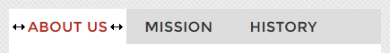 The left/right padding inside a tab / accordion heading. The left/right padding inside a tab / accordion heading. |
| Tabs style | You can check tabs style here. |
| Tabs transition | Transition animation when switching between different tab panels. |
| Accordion Style | You can check accordion style here. |
| Auto height | All panels will be set to the height of the tallest panel. |